Photoshop Tutorial: How to Edit a Portrait or Headshot Workflow

Photoshop Tutorial: Portrait Post-Processing Workflow
This tutorial will cover my typical post-processing workflow for a portrait or headshot.
Hey gang! Over the years, I’ve learned a ton of valuable information from online tutorials. Videos are more popular than ever and I watch a few each week to keep learning.
However, I started back in the days of written tutorials—’tuts’ as we called them. Perhaps I’ll make more of these (let me know in the comments), but this is #1.
For this tutorial I assume you already have a working understanding of Photoshop and Bridge. These techniques translate to other image-processing programs like Lightroom and GIMP.

NOTE: You should already be aware of adjustment layers, masks, and blending modes. This tutorial will help you perfect those techniques.
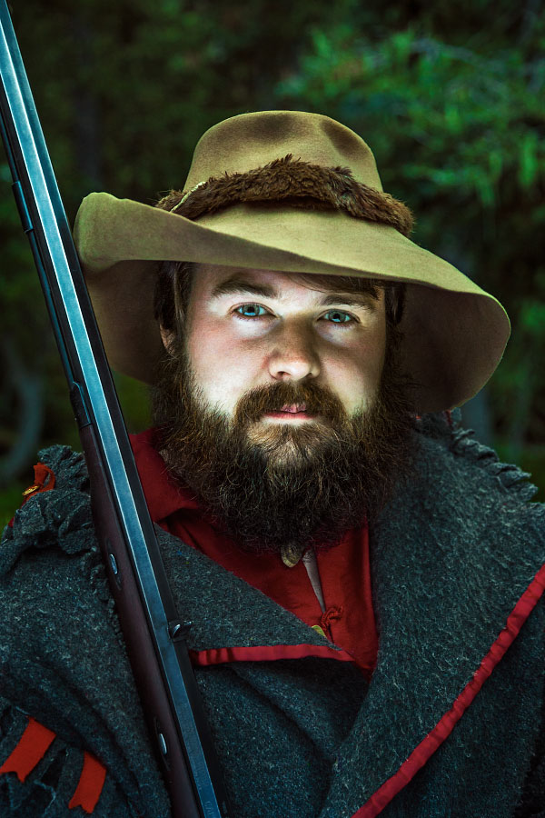
The Photo: Before and After
 |
|
The photo I have selected is Will McKinney at Clear Creek, Philmont Scout Ranch from 2016.
This portrait is typical for me, in that:
Focal length is between 50-150mm; this is at 65mm. I prefer 100mm.
One light; the sky. And the available light is fading quickly.
Bounce-fill; which happened to be the stark backside of an Area of Responsibility map. Or if you are unfamiliar with the Ranch, a 2x3’ laminated map.
Friendly Crop variations. This image looks great at 2:3 all the way to 1:1. There’s even a good landscape option in there as well.
You can check out my portfolio for more great examples of these types of portraits.
Part I: Shooting
What made this a non-typical image was its under-exposure. It’s really, really dark.
Why?
I was forced to shoot at the far-end of the settings I normally choose. You can see my camera settings just below the histogram. I knew these settings would yield the sharpest, least-noisy results possible; something I’m always striving for.
Usually I go with a soft clam-shell light at 100mm, lighting the face around f/6.3, ISO 100 and a sync-speed which drops my background -1 or -2 stops. I use the Photek Softlighter II and it’s a dream. But that didn’t fit in my backpack on this occasion.
This was shot with natural light. It was 7:30PM, and Clear Creek is nestled in the pines. There wasn’t much I could do but work quickly.
Raw image, no adjustments, straight out of camera.
‘Basic settings’ panel in Camera Raw 9.1 with no adjustments.
REMEMBER: Camera settings are not secret formulas. You’ll find your own style and flavor after practicing.
With a good pose from Will and some great luck, I got a suitable capture. I checked the LCD and saw a sharp image and an acceptable, albeit dark, exposure (no crushed blacks or clipped highlights).
Back at the computer after an exhilarating summer,
I’m ready to begin.
Part II: Camera Raw
50% zoom level; the image is sharp and noise is manageable.
After importing and selecting the file in Bridge, I open Camera Raw Editor to apply some global post-processing edits in order to get the file ready for Photoshop.
The goals of this process, for me, are:
Good exposure. Doesn’t have to be perfect. Generally a little brighter than the intended end result.
Vibrant colors. Colors are easier to select, change, and modify if they are vibrant and well-saturated. Usually my image is too colorful after this stage.
Dodge and burn. Camera Raw Editor has great gradient and brush adjustments. I find myself making a slight vignette, even though there is a panel for that as well.
(Click images to enlarge.)
Fig. 1: Camera Raw panel settings after adjustment.

Fig.2: Adjustment brushes before and after.
Fig. 1, from left to right: in the Basic panel, you can see the exposure and shadows have been greatly increased. In the H/S/L panels, I increased the color saturation, and in most cases, darkened the luminance values. In the Camera Calibration panel, the shadows have been tinted magenta, and the blue channel has been shifted slightly.
Fig. 2: Lastly, I use the Adjustment Brush (K) for any local effects. I darkened his coat and hat and changed the white balance slightly. I brightened his face, eyes, and other deep shadows above his ears. A common technique for me is to use a -50 Clarity brush to subtract contrast from less-important details. Less contrast, less eye-pull. Check out the before and after of the adjustment brush effects above.
The processed Raw image.
NOTE: After doing this process a few times—many times—you’ll begin to understand what type of file you are ultimately striving for.
I remember wanting to copy all of the edits like I was following a strict baking recipe. It’s better to think of photo editing techniques like stove-top cooking rather than baking. David Hobby of Strobist makes the analogy like adding salt to soup: season to your taste.
After a quick coffee break, I’m pleased with the outcome and ready to move on to the next step; Photoshop.
Part III: Photoshop
Open File
Photoshop is where I take care of any pixel edits, toning, and local color/contrast adjustments. It’s easy for me to get carried away with all of the options available, but follow a typical plan-of-attack.
First, I start with an Action I made. It’s pretty basic, here’s what it gives me.
A duplicate layer (Ctrl+J). It’s a great idea to work on pixel edits on a separate layer for possibly future-recovery.
Two Curve Adjustment layers, one light curve and one dark curve, each with blend modes set to ‘luminosity’, and both placed in a group. More in Step 2.
Selective Color Adjustment layer, as well as an empty layer with a blend mode set to ‘color’ (used rarely), and placed in a group.
The file is opened and a custom action is run, leaving me with five new layers in two separate groups.
Step 1) Pixel Edits
I recall a college professor saying, “every photo needs spotting”. I always start with pixel edits. No sense in fine-tuning something if physical parts of the image are going to move around.
Generally, I remove specular hot spots. I quickly zoom in and out of the image, and anything which catches my eyes I subdue or clone-out.
Will is blessed with a great complexion; I didn’t have to do much of anything for his skin.
His hat needed work. Lots of little stains and things to catch your eyes. A mixture of Patch Tool (J) and Clone Stamp (C) on the duplicate layer are perfect for small jobs like this. There was one minor bokeh flare in the top left. This was a very easy retouching job; I wish most of my images were like this.
Check out the .gif to see the effect; it’s subtle, but noticeable on the hat and coat fringe camera-right.
NOTE: This is a great reminder why it’s a good idea to nail the shot in camera; it makes your life easy.
Step 2) Curves, Light and Dark
Dodging and burning comes from the days of film. In the digital age, I have found a solution which works for me. You’ll see variants of this technique, some which preserve colors better, but I’m partial to my own method.
A Curves layer, making an aggressive curve downwards, darkening your overall image.
A Curves layer, making an aggressive curve upwards, lightening your overall image.
Invert (Ctrl+I) both masks to black to hide their effects and set each to a blend mode of Luminosity.
Any edits on these masks affect the luminance value of the pixel while preserving the hue value.
Then comes the magic. I have a Wacom Tablet, which means I can paint my effects; it’s really fun and easy. I set myself a nice soft brush, low opacity and flow (10-20% each), and begin painting white on the black masks. White reveals, black hides.
This is what my ‘Darks 1” layer looks like.
This is what my ‘Lights 1” layer looks like. The eyes are most noticeable.
NOTE: The more aggressive your curves adjustment, the more sensitive and lightly you have to paint on the masks. 50% opacity on a brush with a steep curve like the one shown above will yield very heavy, obvious results. Build up the effect with light, low-flow brushstrokes.
Sometimes, I start zoomed out and attack big areas with a large, soft brush. Sometimes I start zoomed in with a small, hard brush and paint in fine details. It depends on the type of image. I spend double the amount of time darkening my images as I do brightening them as evidenced by photos above. Most of the time this entire step takes between 5-30 minutes.
Step 2.5) Additional Lighting Layers
If I am unsatisfied with the results from the step above, I'll add additional luminance adjustments. These are usually targeted Curve Adjustments which I paint in with my tablet.
In particular, I felt this image needed:
A masked Curve layer to darken his capote (coat), set to Luminosity blend mode.
A masked Curve layer to darken his hat.
An Exposure Adjustment, brightening the overall image. (Not shown).

This layer darkens his hat

This layer darkens his coat.

Here’s the effect of all the lighting layers.
That’s a big chunk of work. Time to move on to color toning.
Step 3) Selective Color adjustment Layer
Next, I move on to the Selective Color Adjustment. This affects the overall tone as well as individual colors.
How does it work? The ‘Colors’ flyout menu offers the user a selection of nine ranges for adjustment; six color and three luminance. Each of those is broken down into 4 sliders; Cyan, Magenta, Yellow, Black—CMYK.
Subtracting a value adds the color’s inverse (kinda). So, the inverse of Cyan, Magenta, Yelow is; Red, Green, Blue. I’ll exclude K/Black since this controls the luminance value (sorta).
Let’s look at the upper left panel, ‘Blacks’. Using the logic above, you can see that while Cyan has been subtracted, Magenta and Yellow have been been added.
Selective Color Adjustment options (Magenta not shown) and their edits.
The effects of Selective Color Adjustment.
NOTE: This will make more sense if you just play around with the sliders. Be brave. Start with ‘Neutrals’; it will be easier to see what effect the changes have on your overall image.
Take a look at the .gif above. You can see an overall shift increasing red/magenta and a decrease of cyan.
Step 3.5) Additional Color Layers
Just like step 2.5 above, if I’m not satisfied with the Selective Color Adjustment, I’ll add additional color tweaks in the forms of Hue/Saturation and Curve Adjustment layers.
I made four major adjustments:
A Hue/Saturation layer to darken and de-saturate his red shirt.
A Curve layer for the green cast on his hat.
Two layers to correct skin tone:
Hue/Saturation layer to shift the reds in his face more orange, and desaturate slightly.
Curve layer tweaking the final skin tone; less blue in the shadows, more red in the highlights.
A global Curve as a final color toning layer (before/after .gif is shown).
1. Hue/Saturation layer for the red shirt.
2. Curve layer to tweak his hat.
3. Here’s the before and after effect of both layers.

4. A Curves Adjustment adds yellow to the midtones and highlights, and adds cyan to the shadows.
The bulk of the work is done. Time for a few finishing touches.
Step 4) Final Lighting
Sometimes, I’ll add another round of ‘Darks’ and ‘Lights’, which usually contributes a subtle vignette effect. This particular image seemed to need the moodier light, so I kept going.
I added two Curve Adjustments, one to lighten and one to darken (sound familiar?), see photos below. Both layer’s blend modes are set to Normal.
A final darkening curve layer.
A final lightening curve layer.
Before and after of the final lighting layers.
We’re in the homestretch.
Step 5) Sharpening, Saving, and Exporting
After finishing my cold coffee, it’s time to save, export, and share my work. Here’s the general process I have for sharing to social media:
Image Size; 1200 pixels at 72 dpi is perfectly fine for most anything online. If I want to post to Instagram, I’ll save a version at 1080 pixels wide.
I find for downscaling, bilinear interpolation (the last menu at the bottom) works the best at preserving sharp details without looking crunchy.
Smart Sharpen; a radius of 0.4-1.1 pixels with an amount from 50-110 percent is usually what I end up choosing.
Save for Web; JPEG, with a Quality setting that gets the file below 500K. (Not shown).
This means I’ll always have the original file at it’s largest dimension in case I need to make prints or any adjustments in the future.
Image Size dialogue box.
Smart Sharpen dialogue box.
the final image:
Final edit.
And that’s my workflow for editing a portrait or headshot.
I really hope this helps some photographers and Photoshopers out there. I remember learning how all of the tools worked for a program, but not knowing how to use them to get what I wanted. Seeing other creator’s processes was vitally important in finding my own artistic style.
I hope this helps!
Thanks!
Well gang, hope you enjoyed.
If you have questions, ask in the comment section below. I promise to respond and if I get enough similar questions I’ll make another tutorial.
Let me know what you liked and please share with a friend.